Direct Mail & Catalog Marketing Data Visualization
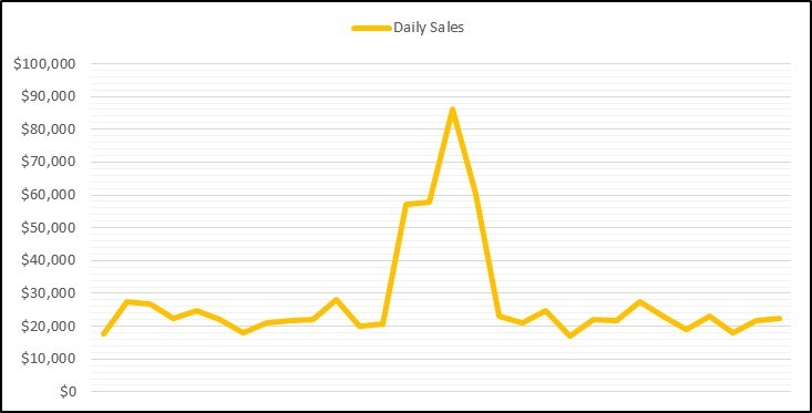
How do you summarize catalog marketing data or catalog circulation test results and other direct mail metrics? A catalog marketing analysis one-sheet is great for recapping a specific catalog test result but sometimes you really need a visual of the catalog data to instantly communicate what happened. The spike in catalog sales in the image above tells you everything you need to know about the effectiveness of the promotion. That’s data visualization!
Everyone who deals with the presentation of information knows how important it is to create visuals of the data. We are aware of the necessity for infographics, charts, and bite-sized information. The increasing popularity of user experience (UX) design is an easy example of just how effective marketing data visualization can be. So, we hire a UX designer, add charts to our decks, and create catalog marketing dashboards to replace the old direct mail reports. It works. We know it works. But what makes it work, and how does it work best?
As is often the case, it boils down to psychology. If you’ve ever gotten off the phone and couldn’t remember what you were in the middle of, you know that there is a limit to the number of things our conscious minds can hold. This is called “working memory”, and studies say that it can hold and manipulate about four groupings of information at once. Data visualization can transfer most of the work from the part of the brain used to think to the part used to see, and this part is faster, more efficient, and more effective than the former. Successful catalog data visuals convey information in a way that allows the consumer to start grouping and processing it before their brain begins conscious thinking, allowing them to fit more data into each of the four spots a human brain is usually limited to.
Do you need help converting boring rows of catalog data into insightful, visual charts and dashboards? If so, give us a call today.
Comments are closed.